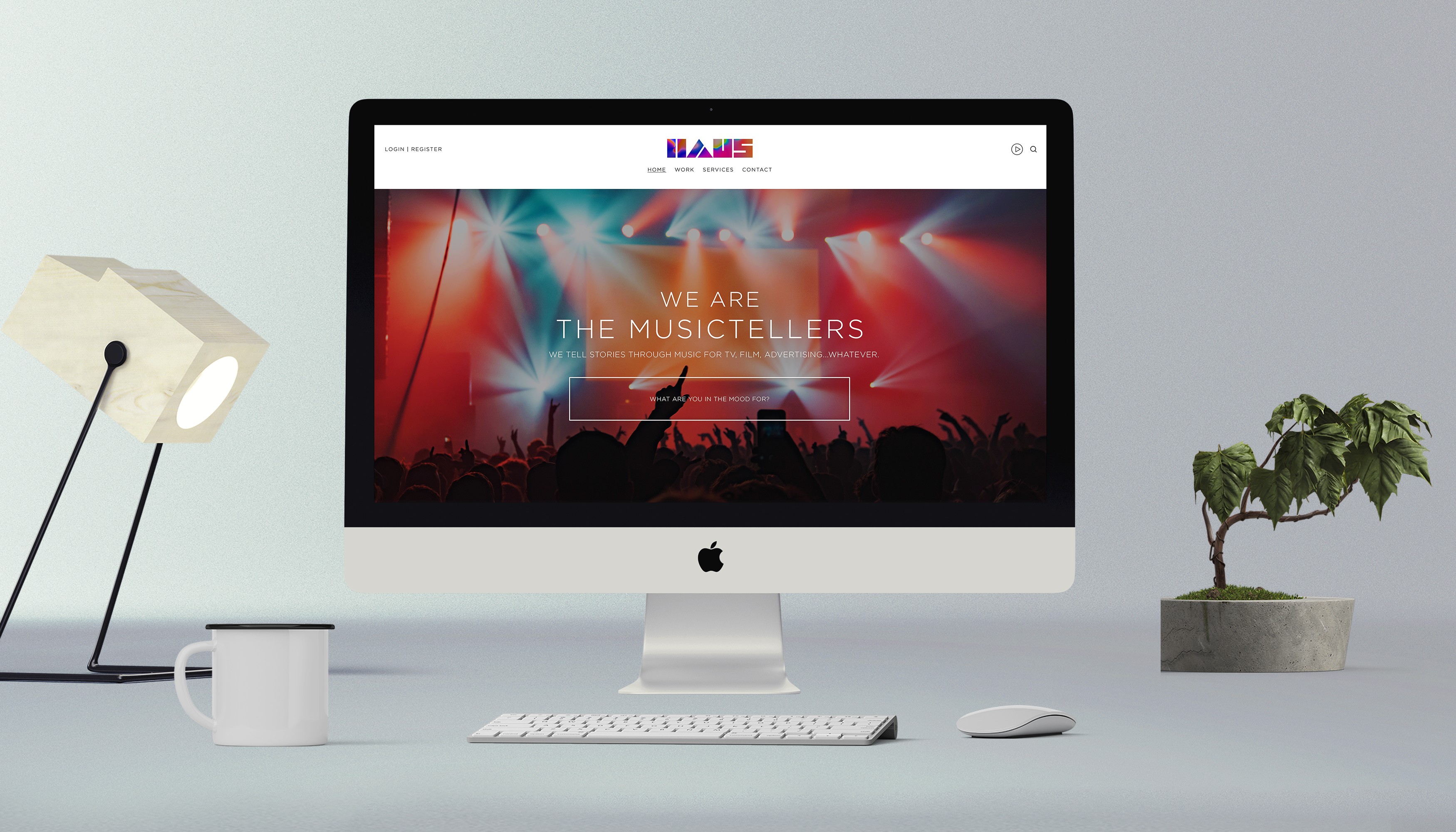
The soundtrack your story deserves
Client:
HAUS Music + Sound
Project Type:
Brand Identity
Industry:
Professional Services
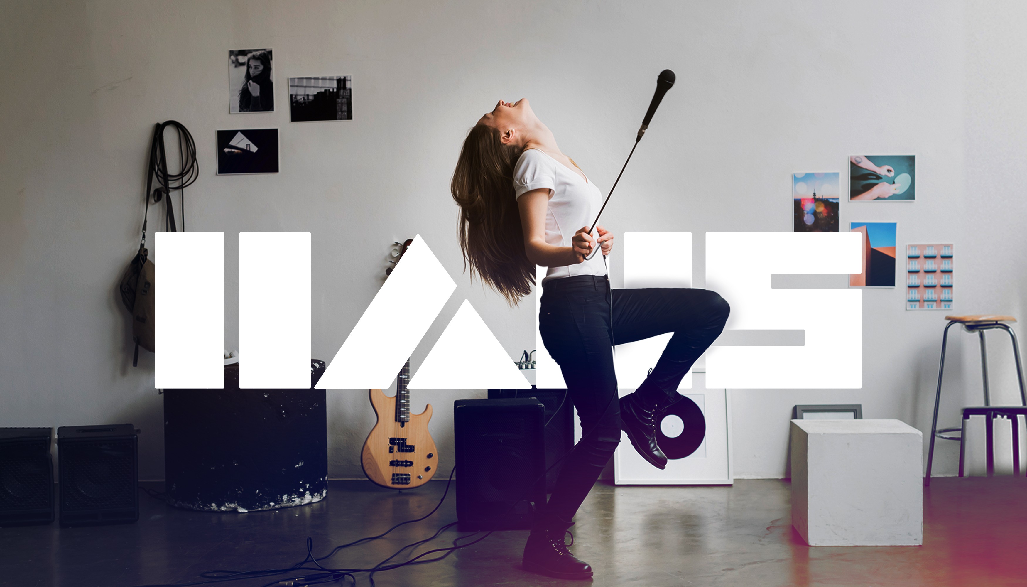
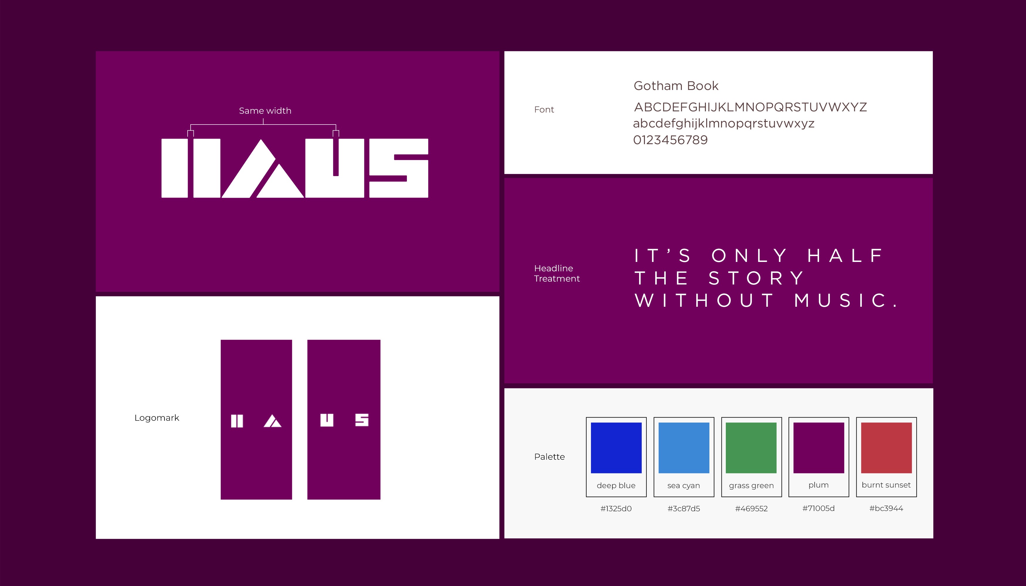
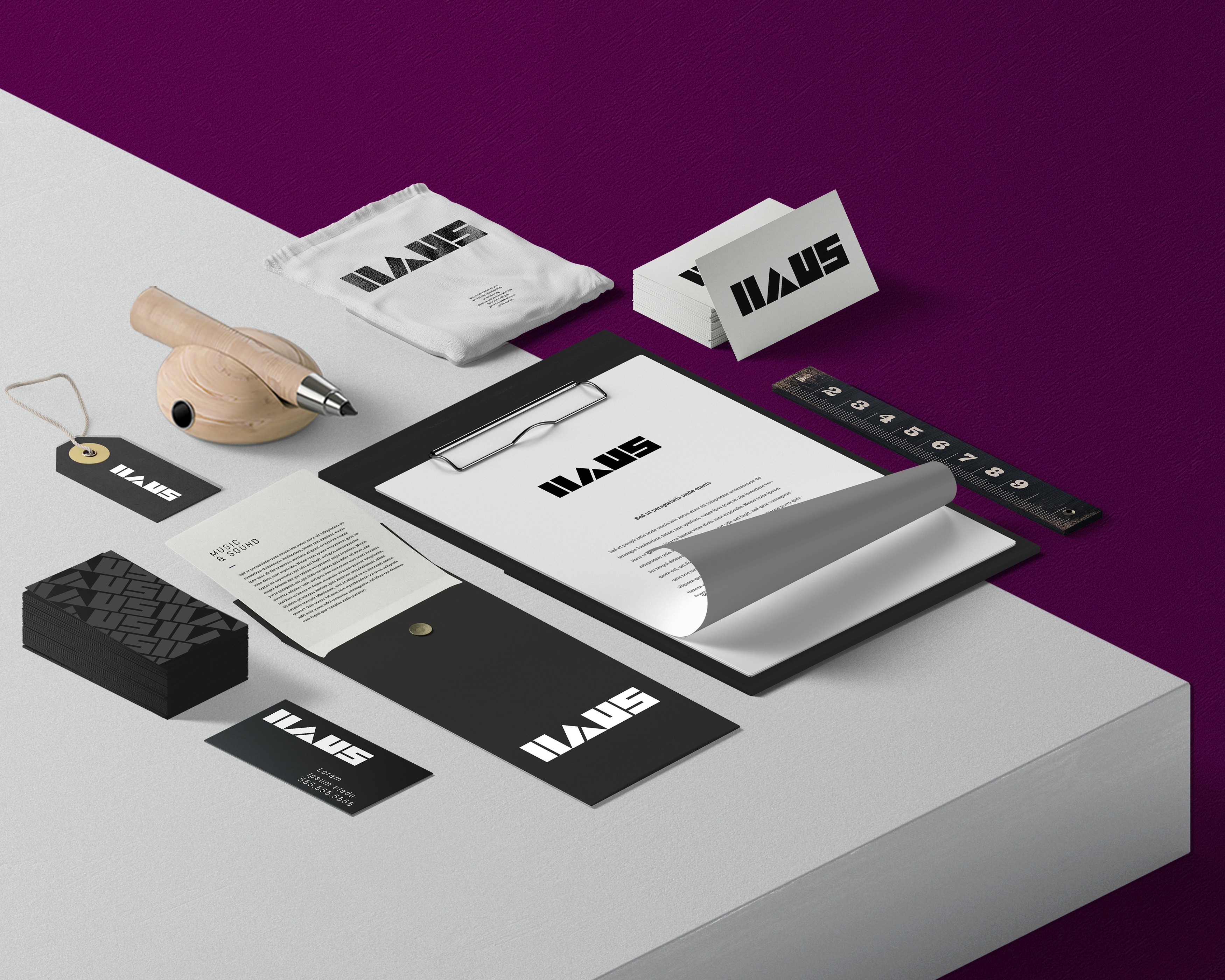
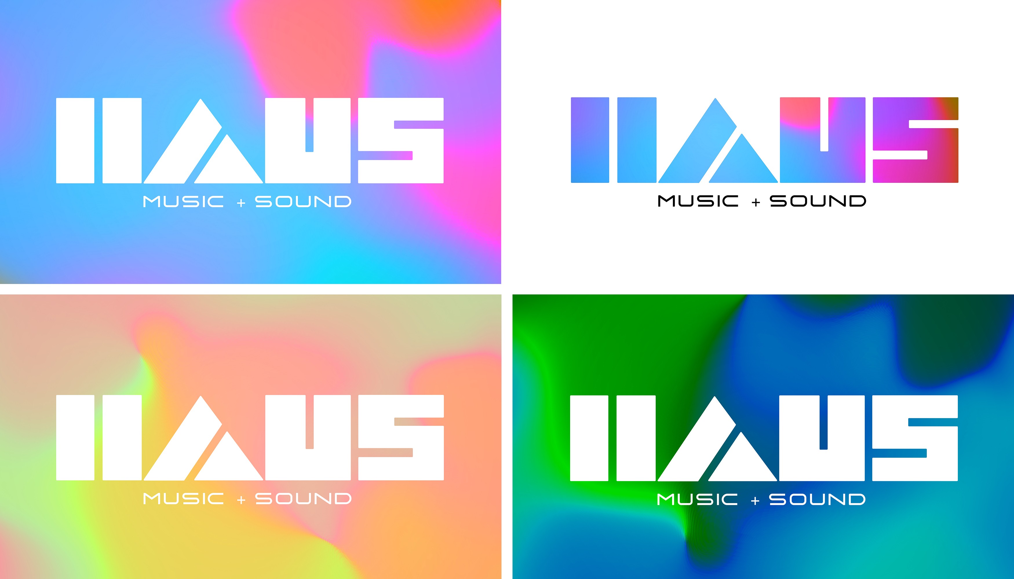
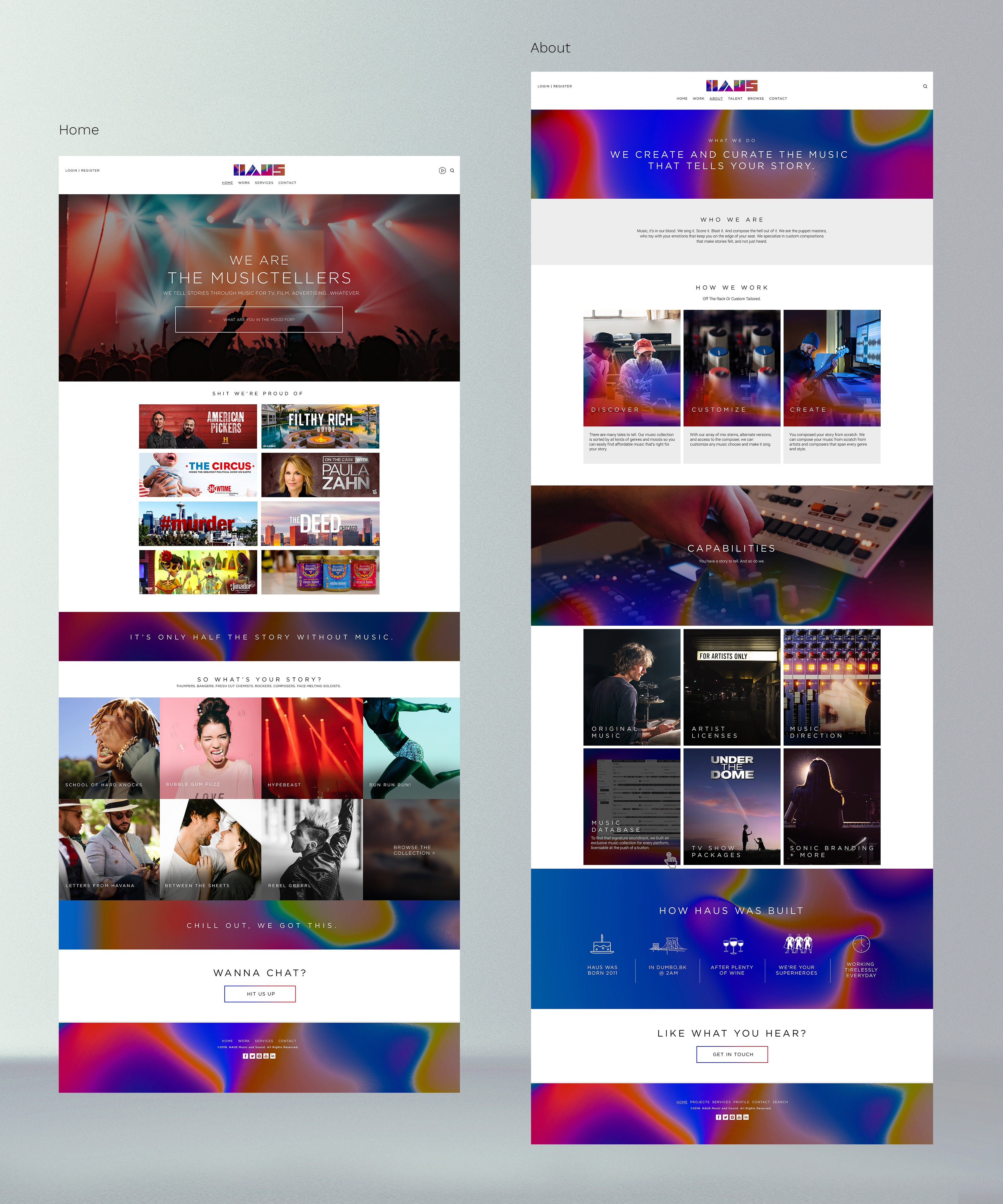
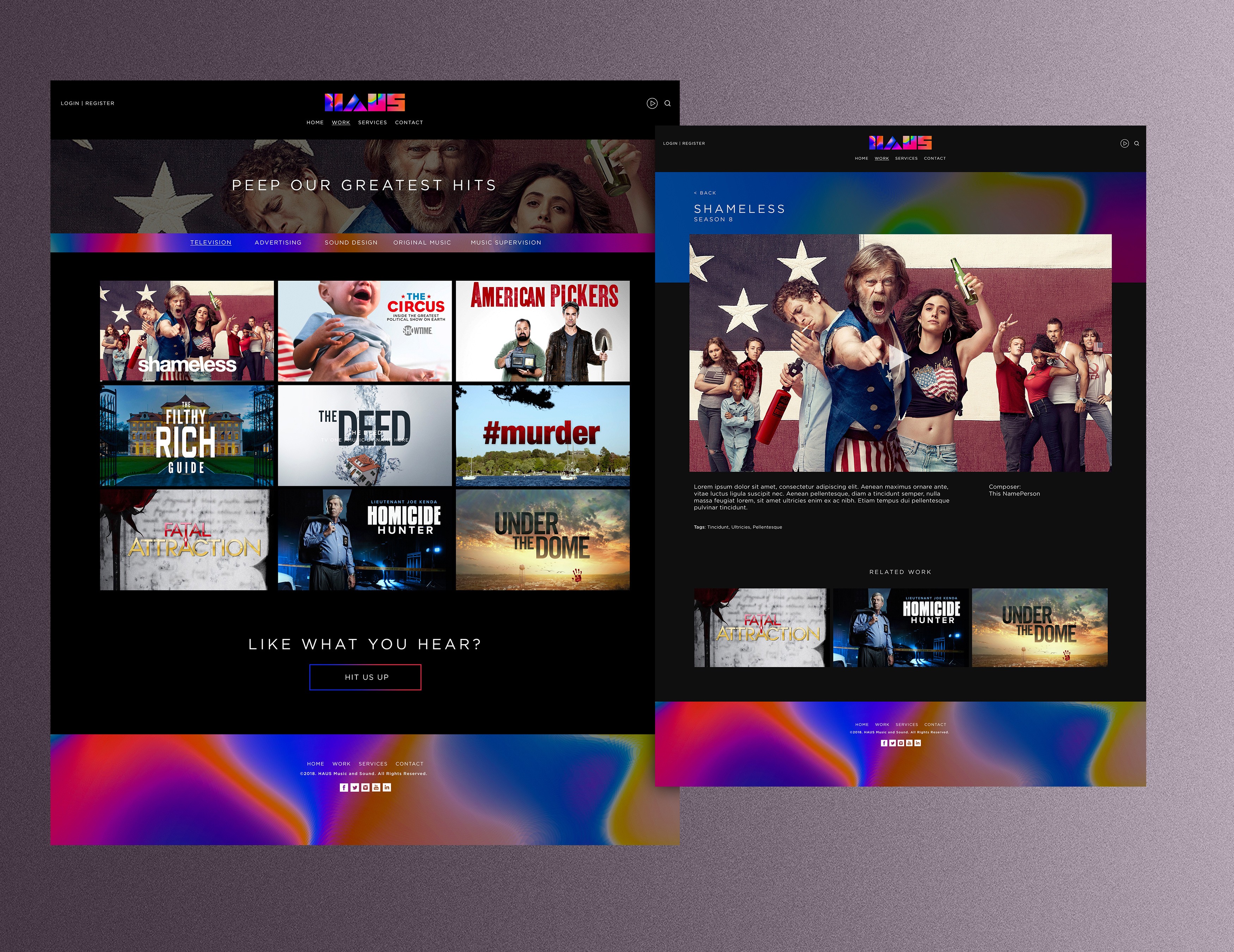
The identity system is built on carefully calibrated tensions. At its center, a mark that employs considered negative space and precise geometric forms creates a foundation of visual confidence. The logo's mathematical underpinning and symmetrical construction speak to the technical excellence of sound engineering, while its spatial play suggests the dimensionality of sound itself. This structural restraint is deliberately offset by an expansive, energetic color system. Rich gradients and vibrant color combinations capture the studio's dynamic range, allowing the identity to shift from subtle to bold as needed. Typography follows this same principle—clean and architectural in primary usage, but capable of experimental display treatments that echo sound waves and musical patterns. The system extends across environmental graphics, digital platforms, and print applications through a flexible grid system. Each touchpoint maintains the core tension between precision and energy, creating an identity that feels both technically masterful and creatively boundless—much like the sonic landscapes HAUS creates.
Dream Team
Eric Rojas - CCO Ron Rosen - CD/Writer
Agency
Six+One
